Joyous Toys E-commerce Website
UX Case Study

Problem Space
The client, Joyous Toys, a family-run neighbourhood toy store established in 1986 in Kuala Lumpur, wishes to expand their business online to support the local community by allowing people to order products via an eCommerce desktop website. Joyous Toys offers highly curated products, customer service and reasonable pricing. Their highest priority is face-to-face contact with its customers.
Our goal is to design a desktop website to showcase the stores’ curated products while maintaining its brand image of “small local shop” appeal with great customer service.
Problem identification
I decided to kick off the discovery phase with a competitive analysis on several toy shops' e-commerce pages. As plenty of businesses have adopted e-commerce, I believe there would be many good practices to learn from their pages and opportunities that can be improved. I've identified 3 leading international toys store and 2 leading local toys store to run a Pulse and Delta exercise and found that:
These features created a pleasant shopping experience:
Clean, simple interface
Easy and straight-forward navigation
Comprehensive and accurate product information and visuals
Ratings and reviews
Recommendation on related products
Fast check out
Hotline service for help on the spot
These issues complicated the overall shopping experience:
Complicated navigations with too many sub-categories
Inconsistent use of space and fonts, outdated UI
Long and complicated check out process
Lack of customer support
Slow loading time

Problem identification
To validate my findings, I also conducted 2 user interviews and 7 surveys on individuals who have bought toys online or bought items on e-com site at any point in time. The goal was to gain insights by understanding users’ online shopping experiences in order to build an optimal toy shop website for Joyous Toys. Some of the key questions asked include:
What does a successful online shopping experience look like for you?
How do you typically browse for toys?
What is one feature that you like about your favourite toy online store?
What is one feature that you dislike about your favourite toy online store?
Problem definition
The key findings from the interviews and surveys showed that most users:
value good price and comparisons
need product page with accurate visuals and description
find rating and review helpful to make decision
need a navigation for them to easily find what they want
finds recommendation feature helpful
some users also prefer to:
shop at their own pace
make payment digitally
ask for help
have a fast check out process

Problem definition
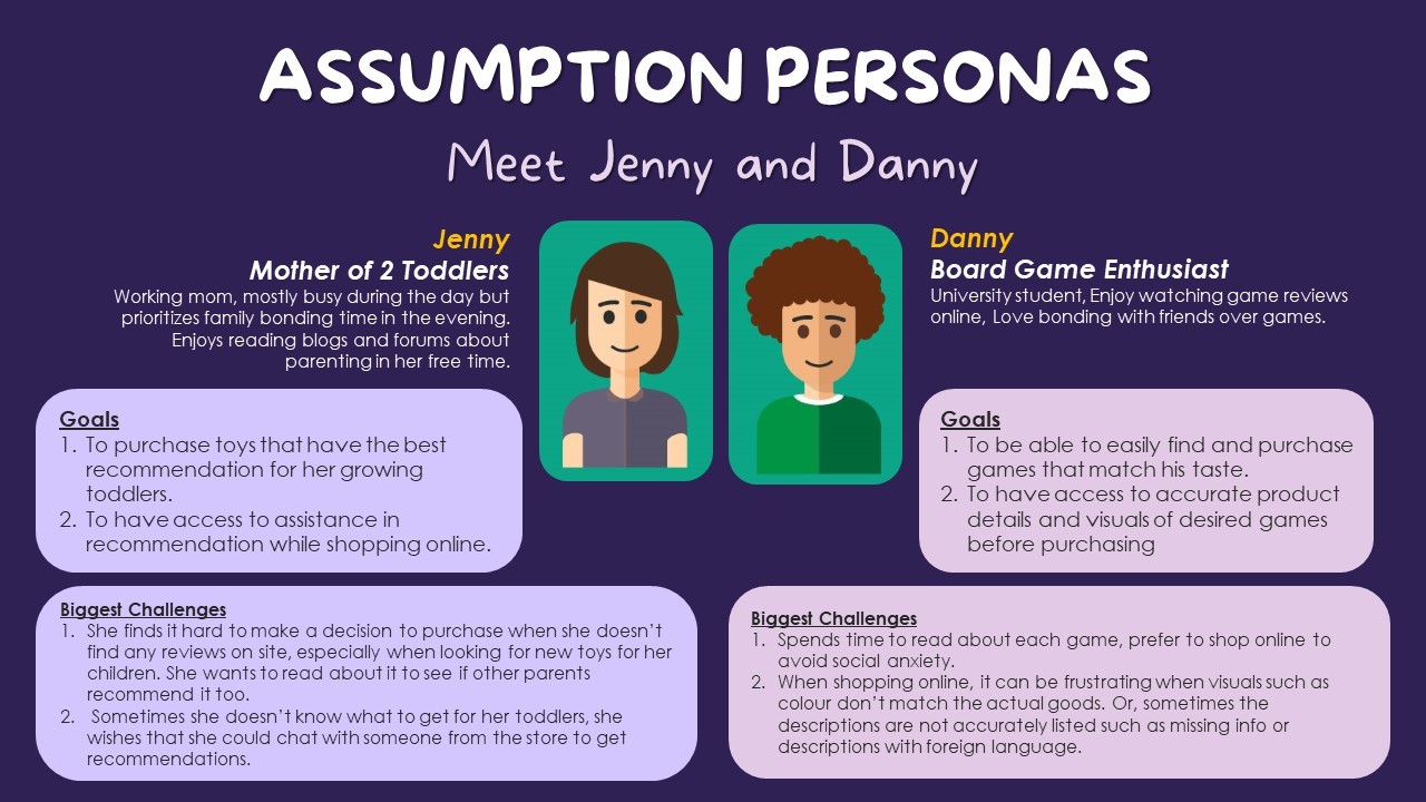
To be able to empathize users on a more personal level, I created 2 assumption user personas based off my interviewees -Jenny, a mother of 2 toddlers, and Danny, a board game enthusiast. From here, 2 problem statements were defined based on each persona's needs.
Problem Statements:
Jenny needs to get the right product recommendations online that so that she can buy the best toys for her children.
Danny needs to be able to easily find and access information about games so that he can have a positive experience purchasing them online.
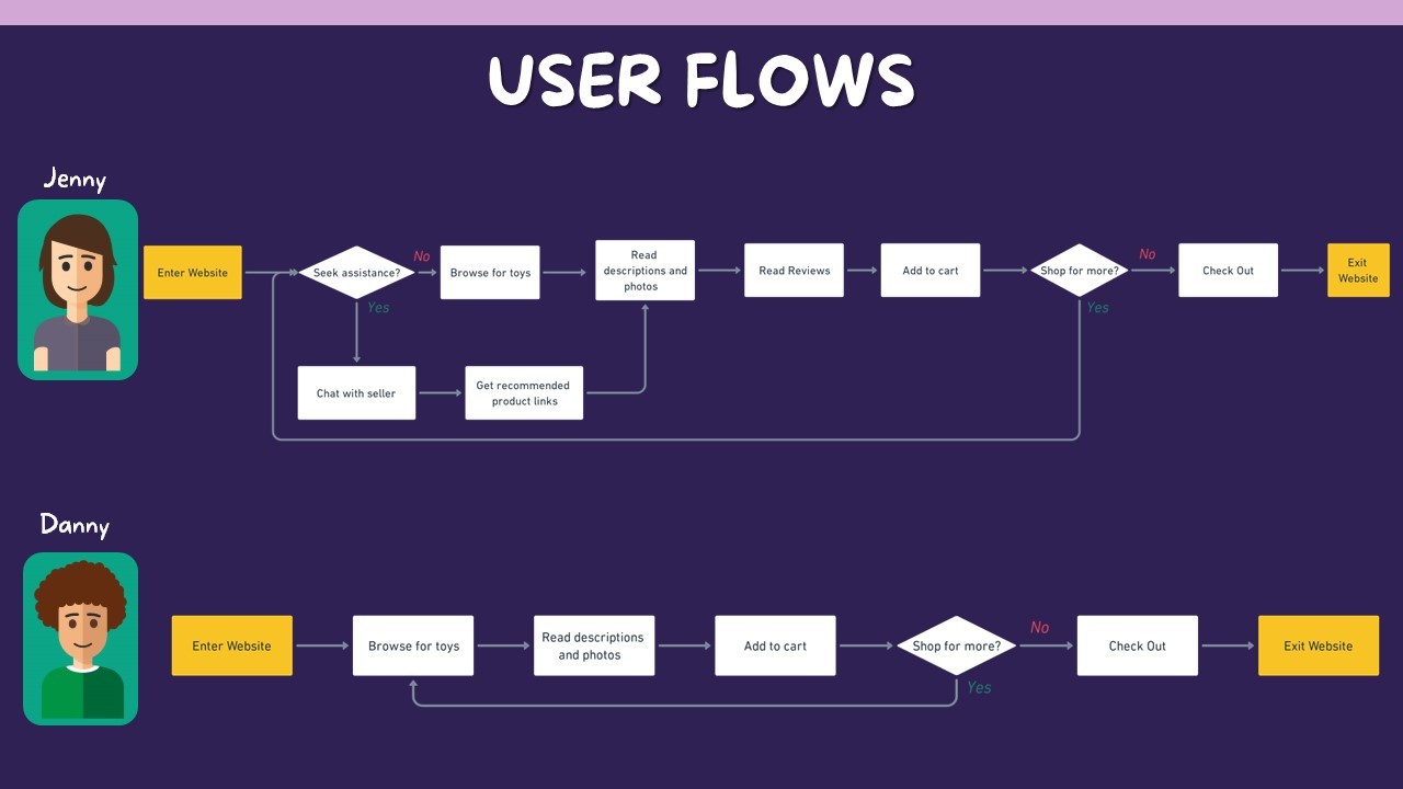
Design divergence
In the ideation stage, I created an ideal user flow for each persona to explore features to include to ensure a positive shopping experience. Combining this with the exploration of How Might We statements, I decided to explore these key areas:
How might we recommend products ?
Provide product links to pages via chat or hotline
Based on past data such as "people who bought this also bought"
Based on related products
Based on rating and reviews
How might we display products?
Arrange by categories that are easily understood
Provide special highlights for specially curated products
Display product information and listings accurately
How might we get customers to make a purchase?
Provide a quick and fuss free checkout process
Provide various payment options
Design convergence
For Jenny, she would likely make a purchase if she can get recommendations from a store staff or from reading reviews; whereas for Danny, he is likely to make a purchase if he can easily navigate the page and finds the product information useful for him.
I decided to review the competitive analysis again to finalize the final features of this website. I also took some inspiration from their design layout. From here, I sketched out a rough idea of how the site would include, such as a home page, category page, brand page, product page, check out pages, etc.

Validating concepts
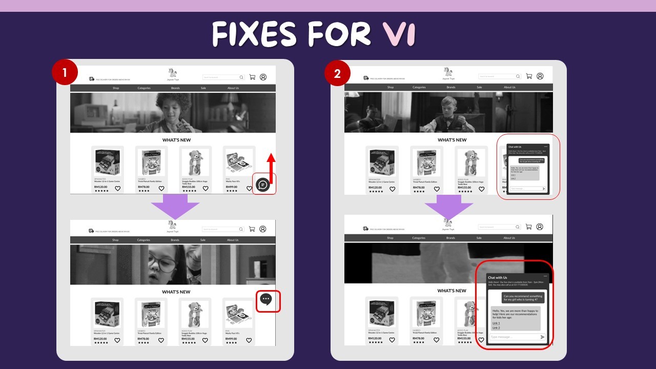
First usability testing outcomes:
Got feedback that usability questions were leading which also resulted in the trouble of drawing insights for improvement.
Some users could not find the chat function due to technical constraints on the testing device.
Users' feedback that the chat function font size was too small (hard to read).
I decided to work on 3 main changes:
Moved the chat box to the middle of the screen to be more noticeable.
Enlarged space for chat function and increased font size from 12 to 16.
3. Reframed usability testing questions with follow-up questions.
Validating concepts
Second usability testing outcomes:
Overall positive feedback with all users able to complete tasks.
Some users prefered to use the search bar directly to find items instead of browsing through the navigation system. This was an unexpected path through the usability test but the current design did include a search bar.
A user expected the listing tiles to have an add to cart function for a more direct shopping experience.
I decided to proceed with the existing design. However, reflecting on this, I should have taken into account the last user's concern and run another round of usability testing.
What's next?
The design above aimed to improve Jenny's and Danny's shopping experience for toys, and the usability testing results have proved that the design solution worked. In the next phase, Joyous Toys could look into a few areas of opportunities such as:
Responsive website to cater not only for desktop users but also mobile users.
Omnichannel approach that links both physical and digital experiences such as "Buy online, collect at store" or vice versa to accommodate customers of different lifestyles.
Digital marketing efforts to increase website reach and exposure.
5 lessons I learnt from this project
Individual work requires high self-discipline.
Working independently allowed me to have more control over my time and work at my own pace, but this also demanded a high level of self-motivation and discipline. I missed a few days during the project as I fell ill and had to revisit my project plan once I was back on my feet. By prioritizing tasks and time-boxing activities, I was able to get on track again and complete the project within the given timeline.
Keep learning new tools to improve productivity.
I learnt to leverage plugins such as Google Sheets sync to populate content in the tiles and product pages which helped to save a significant amount of time vs. manual copy-pasting.
Invest more time in reviewing research questions and usability testing questions to avoid asking leading questions.
I wasn't able to gain much insight into user experience during the first usability test because I fell into the trap of asking leading questions. By refining my questions the second time and requesting feedback after each task, I was able to see a better result and get more insightful feedback.
Don't force ideas as solutions if the users are telling otherwise. Keep an open mind to find a middle ground.
In my 2nd usability test, I received feedback from a user to see the add-to-cart feature on the product results page. I subconsciously dismissed the feedback by forcing the idea of "user needs to go through the product detail page to avoid simply adding items to cart". Reflecting on this, I should've kept an open mind to continue testing and iterating, so that I could find a middle ground to address the user's concern. I am reminded that as a UX-er I have to always advocate for the users.
More tests = Higher Fidelity
I managed to do two rounds of usability testing for this project given the limited time and thankfully, the results were generally positive from the users. But as I reflect on this, I should've allocated more time for this process to give space for further iterations to improve usability and get to a higher fidelity. I made sure to allocate more time for this process in my next projects to have ample time for iterations.