Data Breach Response
UX Case Study

Overview
Australia has faced waves of data breaches this year, including its biggest data breaches in history. Approximately 10 million customer records were compromised in a recent telco cyberattack, equivalenting 40% of the country's population. This resulted in criminals gaining access to customers’ private information such as driver’s license numbers and Medicare card details. In this project, the assumed client is the Australian government seeking a solution to this issue.
This case study delves into how our team designed a solution to provide affected individuals with the appropriate support to identify their concerns, supplement information, and replace documents, as needed.
The process
We leveraged the design thinking framework to tackle this project. The process includes these 5 phases: Empathize, Define, Ideate, Prototype and Test.
📅 Duration: 3.5 week
🤝 Team of 4 designers
🔍 I was particularly hands-on with defining the problem, ideation, low-fi prototyping & testing, and project management.

Empathizing with users
Desk Research
We first conducted desk research to get a broad understanding of the problem premise and discover the type of support available for affected people. We wanted to understand what exactly happened and how a situation like this was handled in the past. We found numerous news reports and articles about the case, and government agencies are already working to relieve the situation.
From the Desk Research we found the:
Type of data stolen
How the company is supporting its affected customers
Preventative methods
Ramifications to customers of the data breach
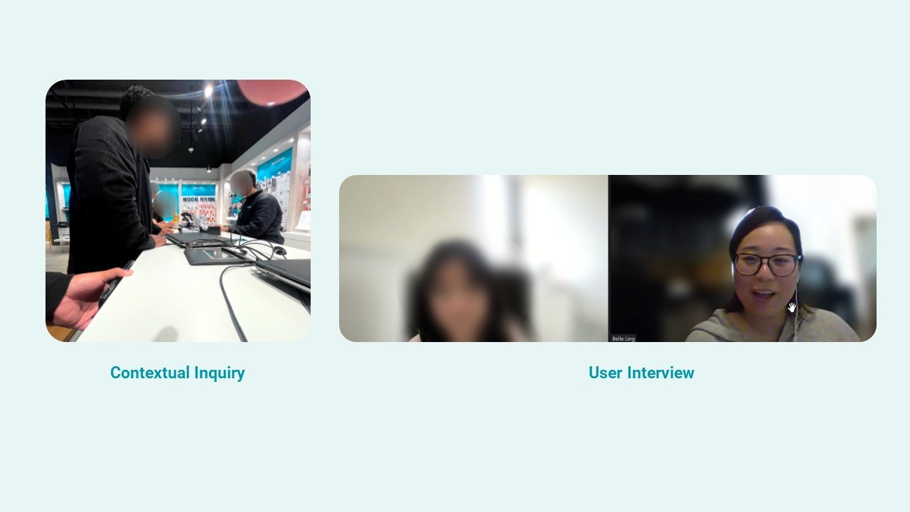
Contextual Inquiry & Phone Interview
To understand users' in-store experience, we conducted a contextual inquiry at one of the stores and a phone interview as a continuation of the in-store experience. We discovered that:
The store employees informed customers that the company would contact them in the future.
They also gave customers a number to call to get further information.
The store employees were reading off the website and prompted customers to visit their website for more information.
Customers were required to visit other government websites to get information.
User Interviews
To dig deeper in the users' journeys, we also conducted 8 user interviews among those who have been affected by the data breach.
Defining user needs
Our key findings were the following:
Users were uncertain of their next remedial steps relevant to their specific needs.
They were concerned that replacing their exposed ID documentation would be inconvenient/time costly.
Considerably more cautious online with their personal details and began to monitor for suspicious activity (e.g. Identity theft/fraud)
Users seek to recover their cost of restitution.
An assumption user persona emerged from the pool of interviewees. We find it helpful to keep a persona as it helps us build our empathy while keeping the user at the centre of our design process. Our goal was to help Harper reach her goals and minimize her frustrations.
By defining the problem, we captured her main concerns and her desired outcomes. Here's our problem statement:
Harper needs clarity and guidance about next steps of action so that she can protect herself from any illegal activity.

Design divergence
As we moved on to ideating solutions for Harper, we explored opportunities through the small but mighty 'how might we' statements and brainstorming with a design studio session. We started with multiple ideas and eventually decided to focus on these key areas.
How might we help Harper understand her situation to gain clarity and identify next steps?
Provide personal assessments to evaluate risk exposure
Provide next steps based on type of data exposed
Using simple colors to indicate urgency to take action
Track actions and steps taken clearly
How might we support users to effectively replace their IDs?
Provide options for online and in-person replacements
Allow direct application within the site instead of redirecting
Clear message and tracking for document replacement
How might we help Harper protect herself from illegal activities?
Integrate sources of information for easy accessibility
Educate with key tips to stay vigilant against cyberattacks

Prototyping and testing
One of our main features was for users to choose between two options to understand what steps to take next.
Option 1: A personalised assessment to show their specific case and next steps.
Option 2: A generic assessment where users can select the type of data exposed and see their next actions.
We turned our final sketches into a quick and dirty lo-fi prototype and started testing with users immediately. With moderated testing, we managed to dig deeper into users' thought processes and emotions to extract valuable qualitative insights.
Prototyping and testing
All in all, we ran 3 rounds of usability testing. We learnt that:
Good content writing takes practice and needs to be tested again and again. We reiterated the assessment option feature multiple times. We started with very short copywriting but the message never got delivered to the users. In our final iteration, we decided to write a detailed description and the users finally understood what we wanted to tell them.
Reduce users' cognitive load by breaking down processes into steps and prioritizing based on urgency. We found in our lo-fi and mid-fi testing and users generally get overwhelmed and lose focus when presented with a lot of information. We used methods such as prioritizing actions based on urgency and bullet points to help users focus better.
Users need control and freedom in performing actions. Users immediately felt trapped when they didn't have the chance to take an alternate option, for example, when the back button was missing and when they did not have an option to skip an action in the process.
Be clear if each process requires action to not. Having a progress completion rate helps to reduce user's anxiousness. We realised lots of misclicks whenever users were not sure if they need to commit any action. We also saw the same issue in our mid-fi prototype that users were clicking everywhere even when they arrived at the end of progress. We fixed this in our final prototype by having a clear indication of completed progress.
Where to host the page matters, especially on handling a sensitive matter such as this on a national scale. We initially planned to have this as an independent website, then we were challenged to think about how could we build trust among the people to visit the page. In the end, we decided that it would be best to host this as a sub-page within one of the government agencies' website. Because of this decision, we also implemented a design system matching the website's existing design.
What's next?
How would users find out about our solution?
This question came up as feedback post our presentation. As we did not have enough data and insight to resolve this, we believe that we will need to collaborate with businesses and government agencies to address this question. We also need to understand:
What are the current touch points planned for release?
What data do we have to understand how users visit the service provider websites and business websites?
What organizations should we align with to instill trust with customers?
5 lessons I learnt from this project
Working remotely as a team is possible & can be fun
As I resided outside Australia, my challenge was collaborating with my teammates remotely and from another time zone. I also had to gain a general understanding of the country, including the types of ID documents, state regulations, and government agencies, as these were relevant information related to the project. I overcame this by researching online and using tools such as Slack, Zoom, and FigJam for virtual collaboration. Our team leveraged each other's strengths in this project by having a lead in each UX process. While we might not always agree with each other, we ensured that we communicated openly and respectfully, and kept an open mind to alternative ideas. The team had also been very respectful of the time difference would find a reasonable time for our meetings.
Conducting ethical research
Our team failed to de-identify the research participants when we presented our photo evidence during the presentation. We were reminded to be mindful of this in the future to avoid research misconduct.
Stay away from assumptions and biases in research synthesis
Our first attempt on the affinity map did not lead us to any fruitful insights. We pre-labeled categories and then tried to fit users' findings into them, which led to a heavily biased result. We corrected this error with another attempt by grouping first and labeling later, and managed to find more accurate themes emerging from there.
Test, test, test.
Each time we tested, we learned something new about our users' behavior which allows us to improve our design. Through constant validations, we were able to reiterate our designs to be more user-friendly.
Continuous learning on UX and UI principles and tools
I would be able to work faster and more accurately if I were more familiar with the laws and principles of UX and UI and fluent in the tools like Figma. I am motivated to improve in this area in my next project.